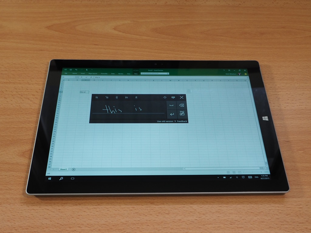
This week we took a moment to try out the Windows 10 technical preview on a Surface Pro 3 Tablet. The main thing that we wanted to see in Windows 10 was the new handwriting input panel concept that has shipped in build 10061.
First though, I would not recommend even trying Windows 10 on your personal device. It’s not ready yet! There are a lot of changes in progress, and what we’re looking at now is not even close to a final product.
However, we are interested in the changes to the handwriting panel because many Windows 7 handwriting users felt that the move to Windows 8 was a big step backward. Sure the Touch Keyboard in Win 8 was vastly better than the Win 7 equivalent. But the floating yellow handwriting input panel in Windows 7 offered a lot more flexibility.
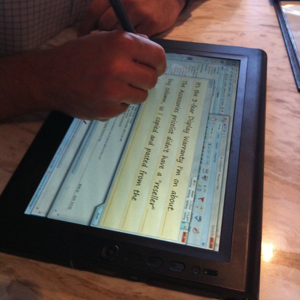
Back in Windows 7 the handwriting input panel could float around your screen and let you input many lines of text at once. Here is an example of the Windows 7 Tablet Input Panel in use on an old Motion Tablet – back in 2009:
Here is what they changed it to in Windows 8 and 8.1:
The actual handwriting recognition capabilities didn’t change much between Windows 7 and Windows 8, but for the sake of consistency we were forced into the black keyboard sized box above. I got used to it, but many long time tablet users hate it!
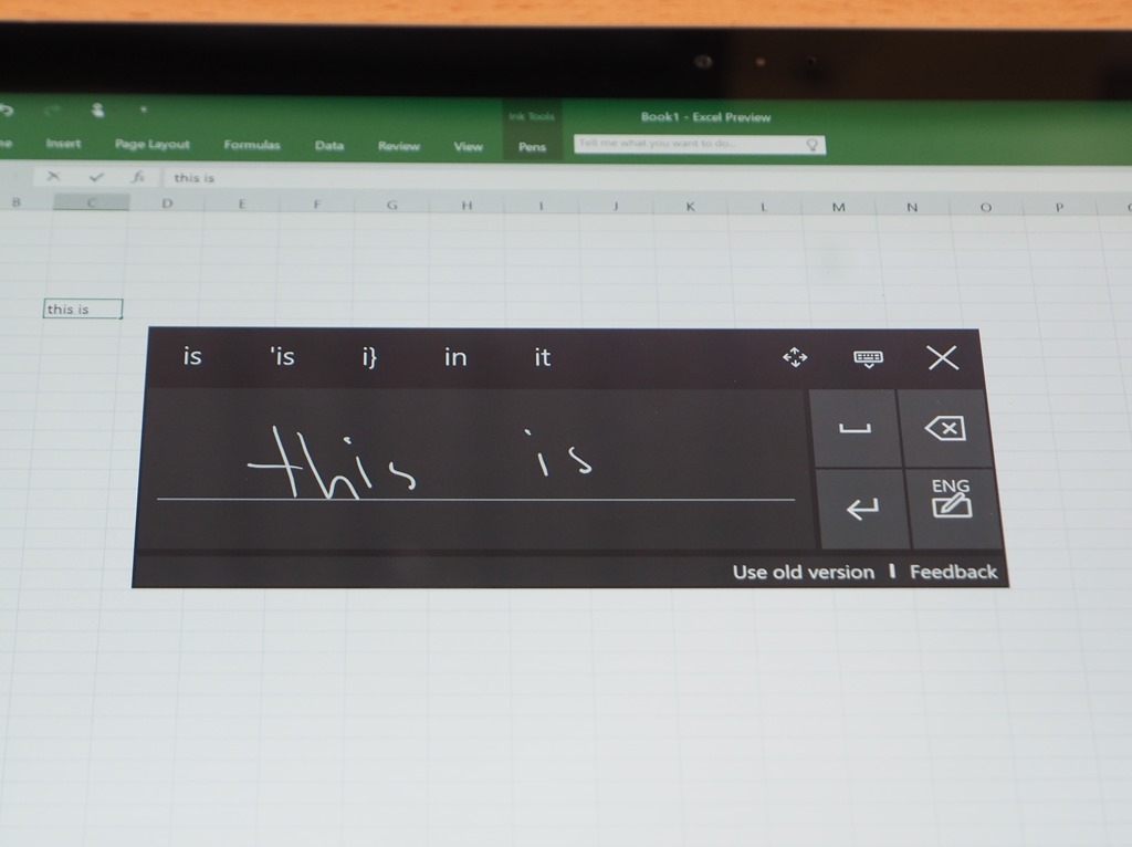
The shot below shows the concept handwriting input panel that’s popped up in the latest build of Win 10:
In this concept, text is converted and directly entered as you write. So in that way it works more like a keyboard. You hit the space button to clear the panel and start a new line. The panel is smaller than the keyboard and pops up near your cursor.
As noted above, this appears to be a rudimentary concept at this stage. Microsoft are building Windows 10 in a completely new way based on big data. It seems to work like this: Throw out a concept, release it to the public (at least enthusiasts and guinea pigs like me), collect some feedback and telemetry, refine, enhance and finish. So no doubt, what we’re seeing now will be seen as a thought bubble when compared to the end product. My observations on it so far:
- Writing for direct entry is a great concept
- The panel needs more space to write in, especially if you’re using landscape mode (of course, it’s not finished)
- Clearing the panel to start a new line is currently a bit clunky (pressing space)
- Correcting is a bit tricky – you have to select one word at a time
- It would be nice if numbers and symbols were there for quick entry
- It is exciting that the Windows developers are paying attention to this important tool once again!
Back in October last year one blog that we read said that Windows 10 is disappointing for tablets. How they could know that nearly a year before the release date is remarkable! The reality of Windows 10 as of April 2015 is looking more like this:
- Good things for desktop mode (a bonus for Hybrid tablet users)
- Great things for Tablet mode.
No doubt there will be some change to get used to – whether you are coming from Windows 7 or Windows 8.1 – but from what we are seeing now, Windows 10 will be worth adapting to.
But you don’t need to wait for Windows 10, here is a list of tablets that will be ready for Windows 10 when it ships mid-year.
