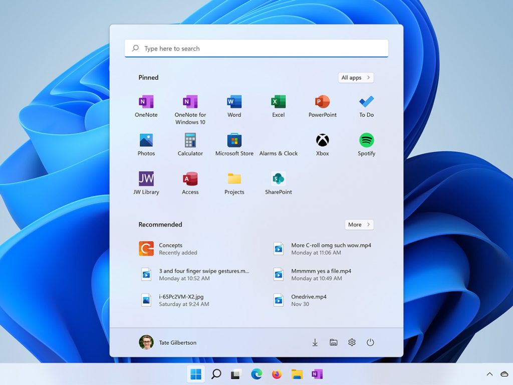
The first and most obvious thing that’s changed in Windows 11 is the start menu. Right away, you’ll notice that the start menu is now in the middle. No, not like a Mac… Apple didn’t invent the middle too. It takes a bit of rewiring to get used to, but it’s not a major change. Why did it need to be on the left anyway? You’ll see why when we take a look at the history of the start menu. But, front and center, that makes sense!
New Layout
Up front there is a list of pinned apps. You can also pin your favorite websites and folders here, which we will see in a moment. Click on all-apps to see the full list of apps that are installed on your device. In Windows 11 you can install apps the old fashioned way (with an executable or installer file), from the Microsoft Store, or via your Web Browser with a Progressive Web App. Soon you’ll even be able to install Android apps on Windows 11 through the Amazon Store! They will all show up here in this apps list, and they can be pinned to your start menu.
Underneath your pinned apps, folders and websites is Recommended. This area shows your recently accessed files and newly downloaded apps. In some ways, it replaces the time-line feature of Windows 10 – although there is no web history here.
Changes from Windows 10
Unlike Windows 10, you can’t organize these apps into groups, but you can re-arrange the icons. Dragging and dropping is the best way to put them into the place that you want them. You can only see 18 apps here at once, but you can have several pages of these icons. It’s best to keep it just to one, concise, screen, showing you just the apps that you need to have within easy reach. The rest will still be listed under “all apps”.
You can’t resize the start menu in Windows 11, so that’s going to force you to keep this space tidy. Do you really need more than 18 apps within easy reach? For most people, probably not. The new start menu works great with keyboard, mouse, touch and pen.
Customise your Start Menu
Pin apps to the start menu by right clicking on them in the all apps list, or on the task bar if they are already open. Select Pin to Start. You can still pin apps to you task bar too, but for clarity it’s best to only pin the apps that you have open all the time to your task bar – leaving the space available for other apps.
Unpin the apps that you don’t need from the start menu by right clicking on them and selecting unpin. This is one of the most important things you should do as soon as you update to Windows 11. Try to make this space as useful as possible.
In the Microsoft Edge Browser, you can pin a website to your start menu like this: Click on the three dot menu, more tools and pin to start. The link will show up on your Start Menu. Clicking on it will open in your default browser. This not some exclusive Microsoft feature by the way. Google could easily implement it in Chrome, but they won’t, so you’ll need to use Edge for this. It’s better anyway, so if you’re still using Chrome here’s a link to our video on why you should switch to Microsoft Edge.
You can also customise your apps list with shortcuts to your most frequently used Folders from the file explorer. Open the File Explorer and find the folder that you use most often. It’s probably right there in your frequently used folders list. Right click on it, go to show more options, and pin to start.
Change your habits!
We’ll see that the original idea behind the start menu 35 years ago was to make apps and files easier to find. So make sure that it’s doing it’s job for you in Windows 11. Today, the start menu can be a dashboard that pops up right over the top of your open programs, giving you access to what you need fast. If you’re still fishing around in a sea of icons on your desktop, it’s time to retrain yourself and adapt to the new start menu which is a much more focused and efficient way of finding things.
There is a search box at the top of the new Start Menu. But, as with every version of Windows since Vista, you can immediately search from the start menu by typing something… For example, Excel. You don’t have to click in the box first. Just open start and type away. Typing on the Start Menu automatically switches to search mode – and you’ll see excel show up in the results list. So if you find yourself clicking on all apps and hunting through the list, why not make the computer do the work. Just type the name of the thing you’re looking for and it will show up. Windows search can even looks for documents, emails, settings and much more.
No live tiles, but more Shortcuts
Live tiles are gone in Windows 11. Icons on the start menu are now just icons. They don’t move and change – which makes it much less distracting and easier to find things. You’ll find your profile icon in the bottom left, giving you easy access to your account settings, lock and sign out. And the power button on the bottom right. But, there is more that you can do with this space.
Let’s open up the settings app, and go to personalisation. Then click on start. Actually, a much faster way to get here would have been to tap on the start menu and type “start.” You’ll find “start settings” right there in the search results, which will take you directly to this page.
One of the things that is missing from the old start menu is a link to the Settings app. You might also want a link to your documents, downloads or pictures folder too. So here, under folders you can toggle on these options, and they will appear on the start menu alongside your power button! Handy!
My experience with the new Start Menu
I’ve been using Windows 11 for many months now, and the new start menu has taken some getting used to. Over time, I’ve come to appreciate it’s simplicity. It’s far less distracting than the Windows 8 full screen approach, and the restrictions have forced me to become a little bit more efficient with the space. However, I do believe that Microsoft will continue to refine and enhance the new start menu – and especially the widgets space that we’ll talk about soon. It might be a while before I can truly say that it’s a complete improvement over the Windows 10 start menu for me.
Controversially, Windows 11 does not allow you to move the task bar. In previous versions of Windows you could dock it to the top, bottom, left or right, but in Windows 11, it’s stuck at the bottom. We’re not sure why that is, but we can’t see any reason that it won’t come back in a future update.
Why so much drama?
So why is the start menu such a hot button issue? Let’s take a quick look at the history of the Windows Start menu to find out how we got here. Before the start menu existed, Windows 3.1 worked kinda like an iPad. There were icons on the desktop, and you could put them in folders. That was about it.
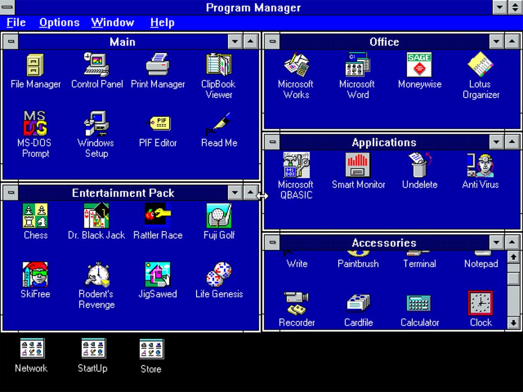
The Evolution of the Start Menu
The start button, menu and taskbar were introduced in Windows 95. There was a very expensive launch event, and in some of the most awkward footage you can find on the internet, Bill Gates and Steve Balmer danced on stage to the Rolling Stones song, “start me up”. The sitcom friends was just finding fame at the time, so there was even an instructional video guide with Jennifer Anniston and Matthew Perry! That of course, came on a VHS tape!
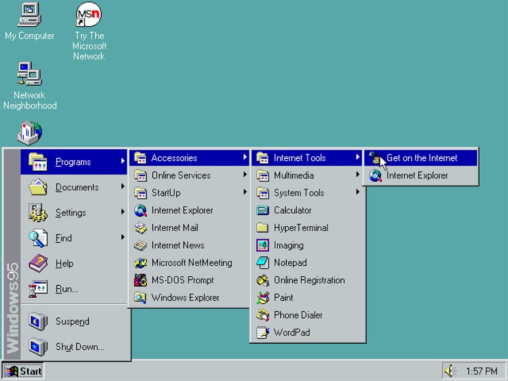
The start menu was billed as a much simpler way to find things in Windows. It was a jumping off point where you could find all of your programs in a list, documents, help, search and settings too. And it all started in the bottom left corner, with the “Start” button that appeared on the brand new taskbar – elements that we still recognize in Windows today. It was in the bottom left corner so that the menus could unfold, left to right – in line with the English language reading style.
Things stayed pretty much the same in Windows 98, ME, and Windows 2000.
Bigger Changes
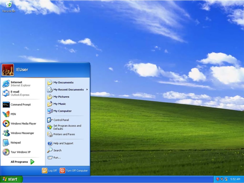
But when Windows XP shipped, the familiar windows icon turned green and got some curves. It also changed the familiar layout of start slightly, with a space for favourite and recently used apps on the left. On the right side, a new option called connect showed up so that you could dial up the internet.
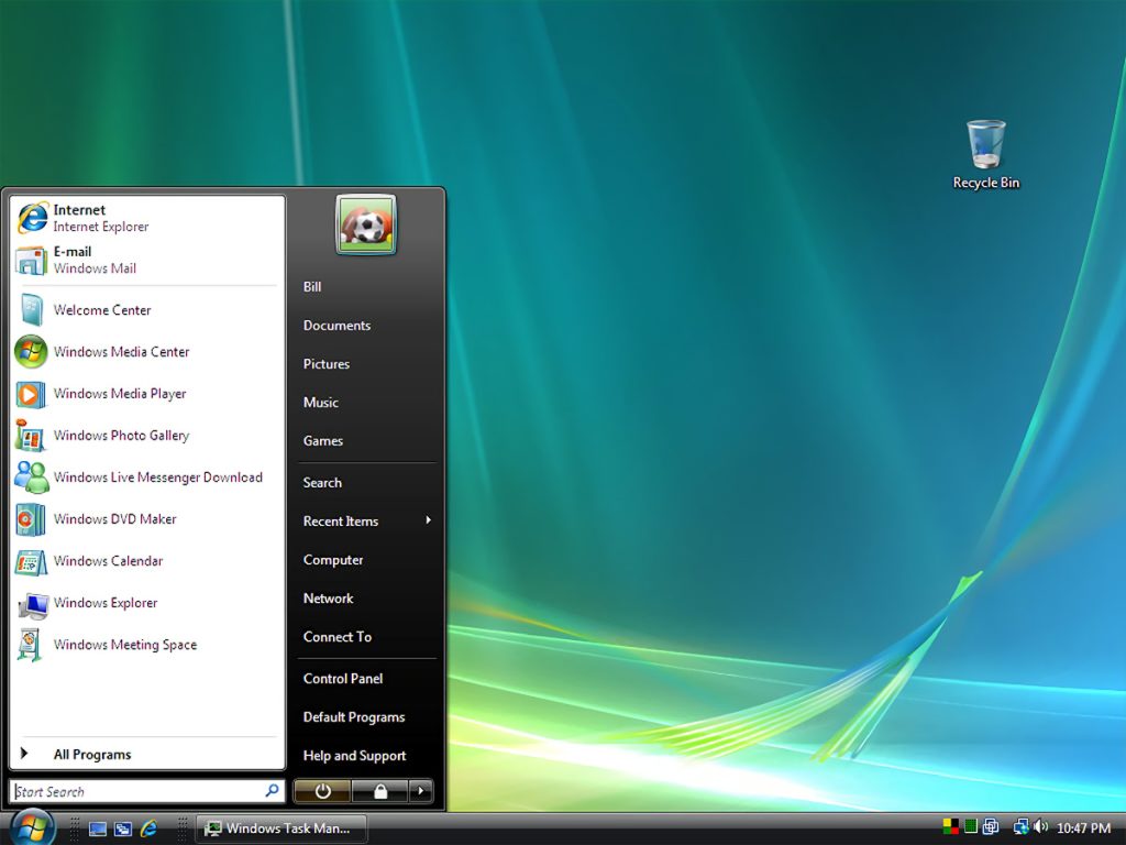
In Windows Vista, the word start disappeared, as pretty much everyone knew by now what it was. But it added the powerful search box right to the start menu making it easier to find settings, programs and documents right across your computer. In Vista, the start menu stopped being an ever expanding list of folders, and stayed within it’s own space. Windows 7 followed the same theme.
The Infamous Start Screen
But it all came to a head in Windows 8, when the whole start menu paradigm was thrown out the window. The start menu became the start screen. Apps became tiles rather than icons. And the icons had live tiles – moving, changing elements that could be handy, but for most people were distracting and confusing. Live tiles were the Windows take on Widgets, where we could get a glance at information from the app, without opening the app.
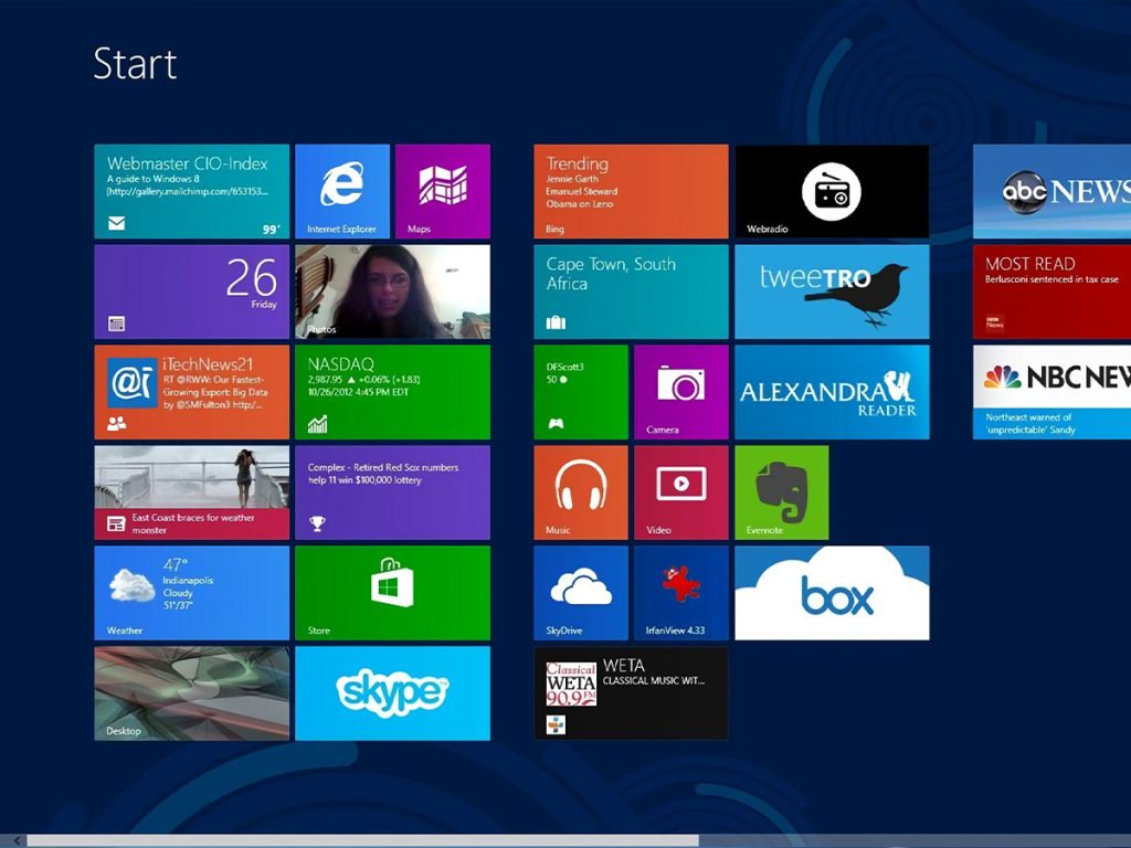
The start screen was not well received by the Windows community. It was clear to Microsoft that the future of Windows lay beyond the keyboard and mouse. Touch screens and mobile devices needed to be catered for. And the I’ll fated Windows Phone was still on the table at the time. Windows 8 was striving to achieve a familiar interface across device platforms, but the market simply wasn’t ready for the change. Major changes were rushed through in the Windows 8.1 update, but it was not to last.
The Start Menu now
In Windows 10, we once again returned to the Windows 7 like taskbar format, with the start menu on the left side, rather than the full screen. The full app list handily appeared on the left. The right side of the Windows start menu was now for your favourite apps, websites and folders, however, the live tiles remained.
Now, here we are in the middle with Windows 11. Make sure you check out our whole series on Windows 11 over on our Youtube Channel!
